

From Vision to Vector: The Creative Journey Behind the ZapBills Logo
When I was given the opportunity to design the logo for ZapBills, I knew it wasn’t going to be just another logo. It had to feel alive — fast, clean, powerful, and smart, just like the product itself.
They wanted a logo that could instantly communicate speed, simplicity, and billing efficiency—all in one look.
ZapBills is a Salesforce-native billing and payment solution, allowing users to generate invoices and collect payments directly from the CRM. So the visual identity needed to be:
As a UI/UX and graphic designer, I took this challenge head-on. What followed was an exciting process of turning an idea into a visual experience.
Understanding the Brand Essence
The product is all about:
The tagline, "Zaps through your billing—fast, easy, reliable!", set the tone for my creative direction. I wanted a logo that didn’t just look nice — it had to speak the product's soul.
Digital Ideation: From Concept to Symbol
Instead of starting with hand sketches, I began directly in Figma and Illustrator, experimenting with different ideas. But one visual kept coming back to me:
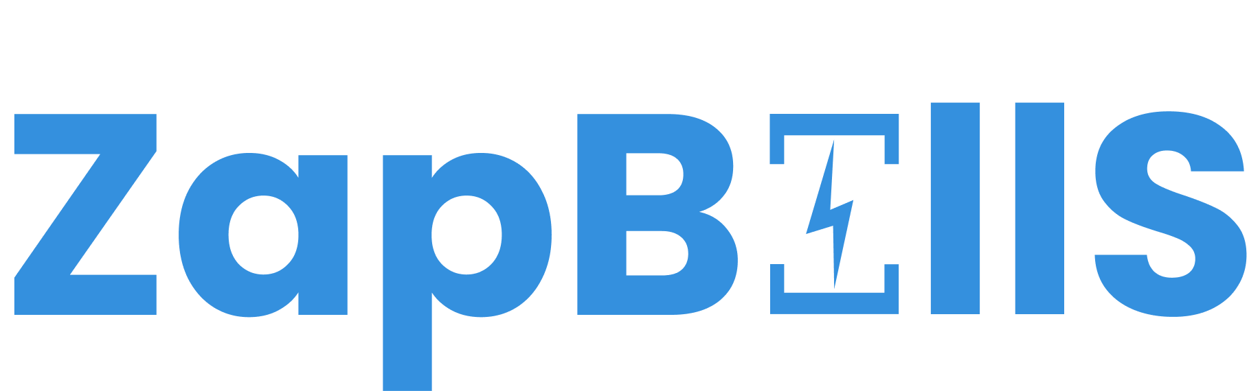
What if the “I” in BILLS could represent both an invoice and a lightning bolt?
That’s when everything clicked.
So now, that one letter "I" in the logo represents both the function (invoicing) and the experience (speed). This tiny touch gives ZapBills a unique identity that’s memorable and meaningful.
Color Choices: Why Electric Blue?
The primary color I chose is Electric Blue (#3490DE) — here’s why:
It’s bold and modern
I wanted the color to feel fast, but not aggressive. Blue always works in tech, but this specific tone brings in a spark — almost like a digital current.
Typography: Why I Chose Poppins
Choosing the right font was critical. I selected Poppins for several reasons:
Poppins also worked perfectly with the icon — the balance between soft curves and sharp edges matched the energy of the lightning bolt beautifully.
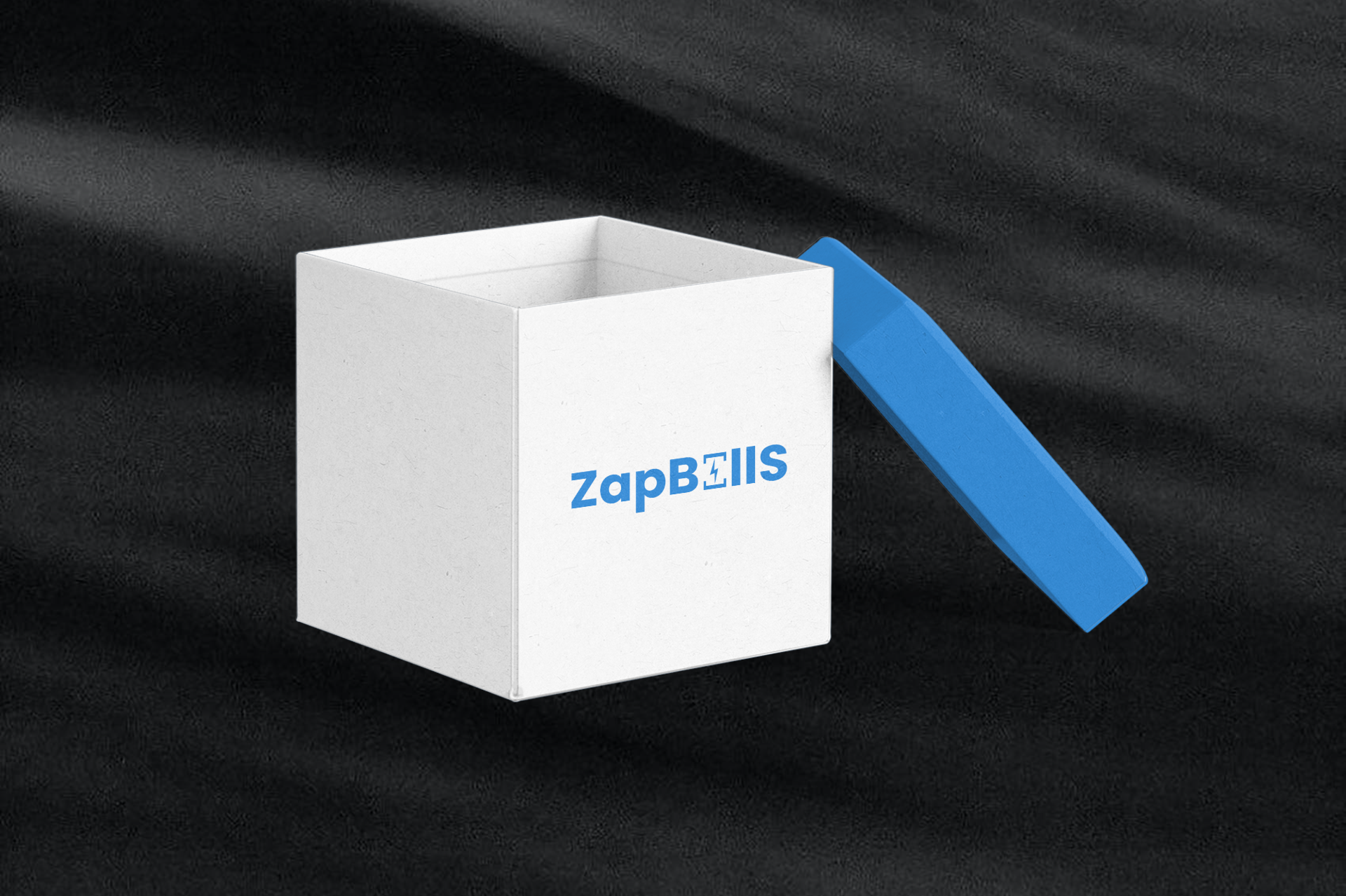
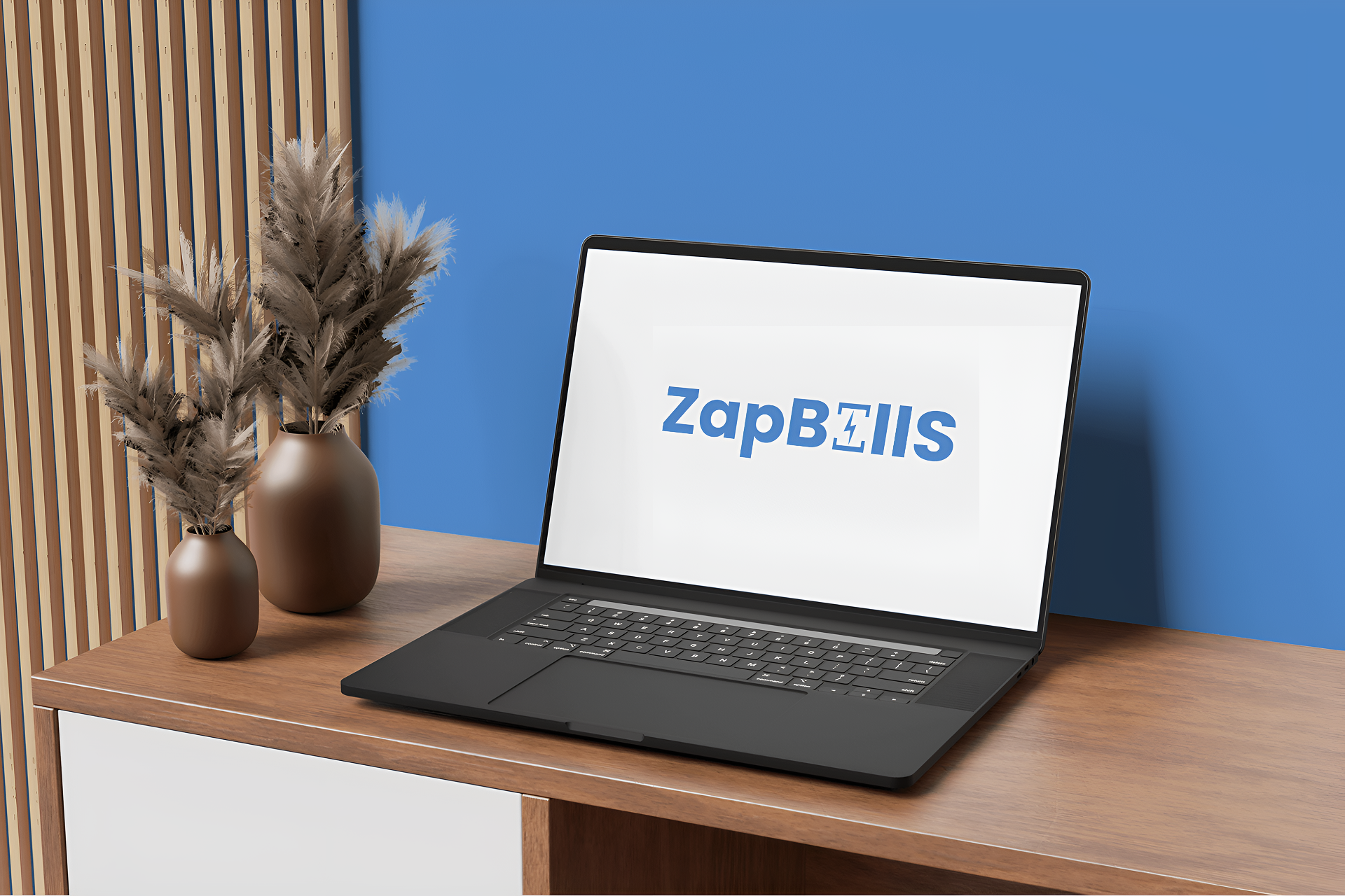
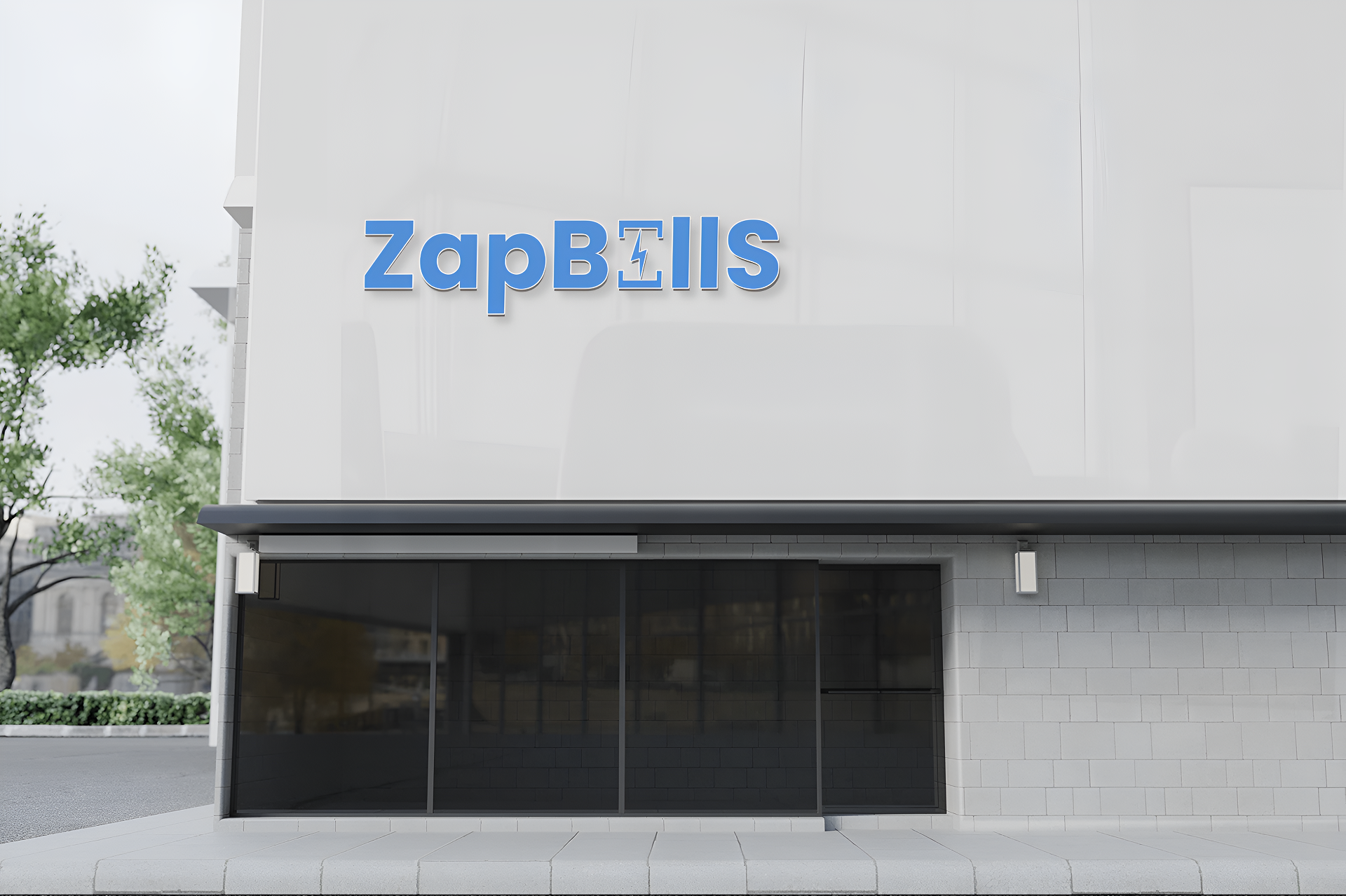
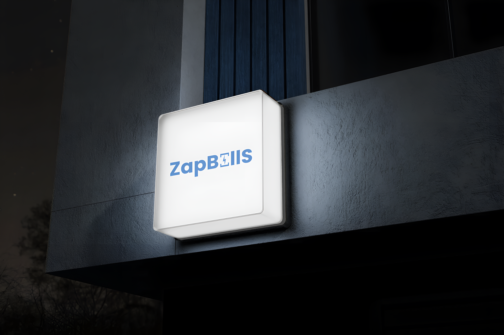
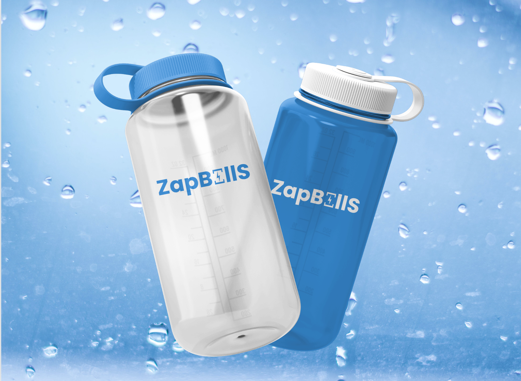
Testing the Logo in Real Use
Once the logo was finalized, I tested it in different formats:
It passed every test — clear, strong, and always recognizable.
Founder’s Reaction
When I presented the final version, the founder’s response was:
“This is exactly what we needed — fast, clean, and perfectly on brand.”
That’s when I knew we’d nailed it.
Final Thoughts: A Logo That Speaks for Itself
This logo isn’t just letters — it’s a story hidden inside a word.
It reflects everything ZapBills promises to its users — fast, easy, and reliable billing within Salesforce.
What’s Next?
The ZapBills logo is just the start. I’m now working on the full product website, which will follow the same design principles — fast, clean, and user-first.
So stay tuned — the ZapBills experience is going live soon, and it’s going to zap through expectations .